

The best booking workflow for travelers follows one path: discover, confirm availability, select your date and party size, pay a transparent total, then get a clear confirmation with reminders that follow. That is the whole shape of a good booking. Everything else is detail.
Before you tap "book," five things should already be visible on the page in front of you: the total price (not a "from" price that grows later), a live availability calendar, a map showing the exact meeting point, the cancellation and modification terms, and a handful of recent third-party reviews. If any of those five are missing or buried, that's your signal to slow down. Baymard's research on tours and experiences backs this up directly: clear logistics and visible reviews are the two factors that most reliably separate a smooth booking from a frustrating one. Im-at builds its listings around exactly this checklist, which is really the point of this guide.
Key Takeaways
A traveler booking workflow succeeds when total price, availability, meeting point, cancellation terms, and reviews are all visible before checkout begins.
| Point | Details |
|---|---|
| Follow the five-stage flow | Discover, confirm availability, select details, pay a transparent total, then receive confirmation and reminders. |
| Check the detail page first | Total price, map, duration, inclusions/exclusions, and cancellation terms should all appear before you scroll far. |
| Watch for shifting totals | If the price changes between review and payment screens, treat that as a warning sign. |
| Scan reviews for patterns | Repeated specific complaints matter more than a single low rating or a single complaint. |
| Im-at applies this workflow | Listings show transparent pricing, mapped meeting points, and instant confirmations by design. |
Table of Contents
- What Does a Good Travel Booking Process Actually Look Like?
- What Should a Tour or Activity Detail Page Include?
- How Should Payment and Confirmation Actually Work?
- Why Do Reviews and Verification Matter So Much?
- How Can Booking Sites Cut Down on Drop-Off?
- What Should You Check Before and After You Book?
- Do You Need an Account to Book, and What Should It Manage?
- How Do You Handle Special Requests or Dietary Needs?
- What Language and Currency Support Should International Travelers Expect?
- Does the Booking Workflow Work the Same on Mobile?
- A Publisher's Note on Getting This Right
- Ready to Book an Activity the Easy Way?
- Sources
What Does a Good Travel Booking Process Actually Look Like?
A traveler booking process breaks into five stages, and each one has a job to do. Here's what should happen at each stage, and what tends to go wrong when it doesn't.
-
Search and discovery. You should only need to enter a date, party size, and maybe a trip style (adventure, culture, family-friendly) to get useful results. Sites that demand ten fields before showing you a single activity are optimizing for their database, not for you. Fewer upfront fields means less friction, and research on booking-form UX for experience-first travelers shows that intent-based search, letting you say what kind of trip you want rather than filtering by a dozen categories, gets people to a decision faster.
-
Selection. Once you land on a listing, you want a calendar showing real availability, not a static "check dates" button, and ideally a quick way to glance at two or three comparable options without losing your place. The listing card itself should already show what's included and what isn't.
-
Pre-checkout review. This is where the full price should appear, taxes and fees included, along with any optional add-ons and a link to the waiver or policy you're agreeing to. If a number changes between this screen and the payment screen, that's a red flag.
-
Checkout and payment. Expect to enter your name, email, and phone, with autofill or a saved profile speeding things along. Payment options should include cards plus digital wallets like Apple Pay or Google Pay, and you should be able to choose a deposit or pay in full where that option exists.
-
Confirmation and reminders. A booking isn't done until you have a confirmation in hand. That usually means an instant email, a reminder roughly 24 hours out, and sometimes a same-day text. Waivers and extra info requests, if needed, should come after this point, not before.
Pro Tip: If a site asks for your passport number or dietary restrictions before you've even seen a price, back out. Legitimate operators collect that kind of detail after booking, not during checkout.
What Should a Tour or Activity Detail Page Include?
The detail page is where you decide whether to trust a listing enough to pay for it, and a handful of elements make that decision easy or hard.
Above the fold, meaning what you see before scrolling, you should find a hero image, the activity's name, the actual total price, an availability indicator, and a booking button you can act on immediately. This isn't a minor design preference. People spend the majority of their page-viewing time above the fold, so anything critical buried further down risks getting missed entirely.
Below that, look for:
- The exact meeting point on a map, not just a neighborhood or city name. Baymard's UX testing on travel sites treats this as one of the highest-impact fixes a listing can make, and for good reason: a text address alone leaves you guessing on the morning of the activity.
- Duration, start time, and a meeting time window, so you know exactly when to show up and how long you'll be committed.
- Pickup or transport options, if relevant, plus accessibility notes and any physical requirements (stairs, swimming ability, altitude).
- Inclusions, exclusions, and what to bring, along with group-size rules that tell you whether you're booking a private slot or joining a shared group.
- Cancellation and refund terms, clearly stated near the price, not hidden in a footer link.
A well-designed page uses progressive disclosure here: a short summary up top, with full details expandable for anyone who wants them. That keeps the page from feeling like a wall of text while still giving you everything you need.
Pro Tip: Scan for a calendar that visually distinguishes available dates from sold-out ones. If a listing forces you to click into every single date to find out whether it's open, that's a workflow problem, not a booking problem.

An empirical study on tour and activity detail pages found that features like clear inclusions and exclusions, stated cancellation policy, and accessibility notes have an outsized effect on customer satisfaction relative to how simple they are to implement. Small additions, big trust payoff.
How Should Payment and Confirmation Actually Work?
Payment is where trust either gets confirmed or gets shaken, so the mechanics matter more than they seem to on the surface.
You should be able to pay with a credit or debit card, and increasingly with Apple Pay or Google Pay for a one-tap checkout. Some listings offer a choice between a deposit and full payment upfront; both are fine as long as the difference is stated clearly before you commit. What should never happen is a total that shifts after you've entered payment details. The full cost, taxes and add-on fees included, needs to appear before you pay, since operational checklists for tour operators treat this kind of price transparency as a baseline requirement, not a bonus feature.
After payment, a real confirmation includes:
- An order or booking ID you can reference if you need support.
- A map link to the meeting point (not a repeat of the text address).
- A link to any waiver you need to sign before the activity.
- A visible contact method for support, whether that's chat, email, or phone.
Cancellation and rescheduling should be self-service wherever possible. A simple link that shows your refund eligibility and lets you reschedule without a phone call removes most of the post-booking anxiety travelers report.
Why Do Reviews and Verification Matter So Much?
Reviews aren't decoration on a listing page. They're often the deciding factor between two similar options, and they should sit directly on the page, not behind a separate tab you have to hunt for.
Look for three to five recent, specific reviews rather than a single aggregate score with no detail behind it. Baymard's research on tours and experiences treats visible third-party reviews as one of the strongest predictors of whether a browser turns into a booker, and that holds whether the review is glowing or mixed. A verified-booking badge next to a review carries more weight than an anonymous star rating, since it confirms the reviewer actually paid for and attended the activity.
Pro Tip: When scanning reviews, look for repeated complaints, not one-off gripes. One person unhappy with the weather isn't a signal. Three people mentioning a guide who showed up late is.
Also check that support channels, chat, email, or phone, are visible on the page itself, not tucked away in a help center you have to search for separately.
How Can Booking Sites Cut Down on Drop-Off?
Most abandoned bookings happen for the same reasons: too many fields, too many choices, and slow pages. A significant portion of people who start a travel booking funnel never finish it (https://resources.rework.com/libraries/travel-tour-growth/booking-engine-optimization), and the friction usually shows up at three points: initial search, customization, and payment.
Good design fixes this in a few specific ways:
- Minimal search fields first. Ask for dates and party size, then layer in filters progressively instead of front-loading every option.
- Mobile-first layout. Large, tappable buttons, a calendar that visually highlights open dates, and content stacked in a single column rather than squeezed into a desktop grid shrunk down.
- Repeated calls to action. A booking button above the fold, another after the itinerary details, and another after reviews, plus a sticky button on mobile that stays visible as you scroll. This isn't cosmetic: sticky CTAs applied to booking flows have been shown to increase checkout conversion by a small but meaningful amount(https://atlasperk.com/guides/website-conversion-for-travel/tour-page-design/).
- Fewer checkout fields. Save passport numbers, dietary needs, and medical details for after booking, when the pressure of "will this go through" is gone.
- Fast pages and forgiving sessions. A slow-loading calendar or a checkout that times out after two minutes pushes people to abandon carts they'd otherwise complete.
What Should You Check Before and After You Book?
Run through this short list before you commit and again once you're done:
- Before paying: total price visible, meeting point on a map, availability shown on a real calendar, and inclusions/exclusions stated plainly.
- At payment: a visible security badge, a cancellation summary next to the pay button, and a waiver link or support number in the flow.
- After booking: a confirmation email with an order ID and map link, any waiver completed, and reminders scheduled ahead of your activity date.
Pro Tip: Save the confirmation email the moment it arrives. If you lose signal at the meeting point later, that map link is often the fastest way to reorient yourself.
Do You Need an Account to Book, and What Should It Manage?
Most marketplaces let you book as a guest, but creating an account pays off fast if you plan to book more than once. A saved profile stores your name, email, and payment method so checkout only takes a few taps the second time around, and it gives you one place to see upcoming bookings, past confirmations, and any pending waivers.
Good account design keeps this optional at the point of booking rather than mandatory. Forcing account creation before checkout is one of the more common ways sites lose a traveler mid-decision. The better pattern lets you complete a purchase as a guest, then offers to save your details afterward with a single click, rather than a full registration form.
Once you do have an account, it should double as a lightweight itinerary manager. That means access to your confirmation history, the ability to message support about a specific booking without repeating your order details, and a way to update contact information if your phone number or email changes between booking and travel date. If you're juggling several activities across a trip, an account that groups them by date range saves you from digging through old emails to remember what you booked and when.
How Do You Handle Special Requests or Dietary Needs?
Special requests, dietary restrictions, mobility accommodations, a birthday surprise, a specific pickup location, need a place to live in the booking flow that doesn't slow everyone else down.
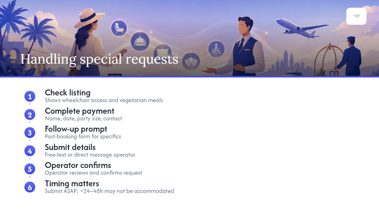
The better pattern separates this from the core checkout. You complete payment first, based on the essential fields: name, date, party size, contact info, and then a follow-up prompt or post-booking form collects anything more specific. This keeps checkout fast for the traveler who has no special needs while still capturing what the operator needs for someone who does.
If you have a genuine accessibility requirement, mobility limits, dietary restrictions, an allergy, look for a free-text field or a direct message option to the operator rather than a rigid dropdown that doesn't fit your situation. A good listing states upfront whether it can accommodate common needs (wheelchair access, vegetarian meals) directly on the detail page, so you're not gambling on a request getting seen in time. Requests submitted less than 24 to 48 hours before an activity may not always be accommodated, so submitting them as soon as you book, rather than the night before, matters more than most travelers realize.
What Language and Currency Support Should International Travelers Expect?
If you're booking an activity in a country where you don't speak the local language, the listing itself should tell you upfront whether the guide speaks your language, not leave you to find out on arrival. Reputable marketplaces list the language of the tour directly on the detail page, alongside duration and meeting point.
Currency display matters just as much. You should see the price in your own currency, or at least a currency you recognize, before you commit to paying, with any conversion clearly marked so you're not caught off guard by your card statement later. A platform serving international travelers across multiple countries needs the flexibility to display local pricing without hiding fees in a conversion you can't easily check.
None of this needs to be complicated on your end. It just needs to be visible before checkout, not something you discover after your card's already been charged.
Does the Booking Workflow Work the Same on Mobile?
It should, and increasingly it has to. A large share of activity bookings now happen on a phone, often while a traveler is already at their destination deciding what to do that afternoon. A workflow that only works well on desktop is a workflow that's losing bookings.
On mobile, this means single-column layouts, large enough buttons that you're not zooming in to tap the right one, and a calendar that's easy to scroll and read on a small screen. It also means the sticky booking button mentioned earlier stays visible as you scroll through photos and reviews, so you never have to hunt back up the page to act. Session timeouts should be forgiving. If you get a call in the middle of checkout, you shouldn't lose your selected date and have to start over. Where a platform offers a dedicated app alongside its mobile site, booking history, confirmations, and push notifications for reminders should sync across both without you having to check two separate places for the same information.
A Publisher's Note on Getting This Right
Booking friction isn't abstract. It's a traveler standing outside a meeting point that turned out to be the wrong side of a plaza, or refreshing an email that never came. A standardized, transparent workflow removes that stress before it starts. Im-at builds its listings around this exact checklist, transparent totals, mapped meeting points, visible reviews, so run any listing you're considering against it and see how it holds up.
Ready to Book an Activity the Easy Way?
Im-at is built around the exact workflow this article describes: transparent total pricing with no surprise fees at checkout, mapped meeting points instead of vague addresses, secure payment with multiple options, and instant confirmations that land in your inbox the moment you book. If you want to see it in action, browse a listing like Tailor-Made 4×4 Tours and check it against the five-point checklist from earlier in this article: total price, calendar, map, cancellation terms, and reviews. You can also look at an event listing like The Unholy Secrets to see how confirmations and logistics show up in practice. Search a destination, pick a date, and book directly through Im-at the next time you're planning a day trip or weekend activity.
Sources
- Tours and experiences launch
- Tour page design for travel: 2026 UX & Conversion Playbook
- A study on the customization of the design of tour and activity detail pages in wine tourism
- Online Booking Features Every Tour Operator Needs (2026 Checklist) | EquipDash